Hello, I'm Gabrielle!
I am a creative designer that emphasizes the importance of versatility and universality in order to create meaningful and engaging communication through graphic design.My design journey started in middle school when I created designs of my favorite tv shows with my friends and illustrations for school events. This hobby quickly became a passion as I realized that design was what I wanted to pursue for my career in high school.Having recently earned a BA in Design from Cal State Dominguez Hills, I have learned many design skills such as motion design, typography, UX/UI, and web design and how to use these skills to enhance a brand.Being a fresh college graduate, I am eager to put my past 4 years of hard work to use and develop a career as a graphic designer. I am excited to utilize my skills to help brands and clients who also believe in using design for good.
Click for my resume

Let's work together!
If you are interested in working with me, please send me a message using the form below or contact me directly through my email at [email protected]. I am also available to contact at any of the social medias listed below the form.
Hearthy Foods Marshmallow Package Redesign
I had the opportunity to work one-on-one with a client from Hearthy Foods and redesign the packaging for the company’s grass-fed vanilla marshmallow snack.Duration: February 2024 - May 2024Tools used: Adobe Illustrator, Photoshop
original design

The Problem
Hearthy Foods’ original design for the product is too plain and does not portray the fun and yummy feel of a marshmallow that the brand wants to evoke. Hearthy Foods wanted to find a design that represents these qualities while still aligning with the brand’s identity of creating healthy food alternatives.
Final Design
the process
Moodboard
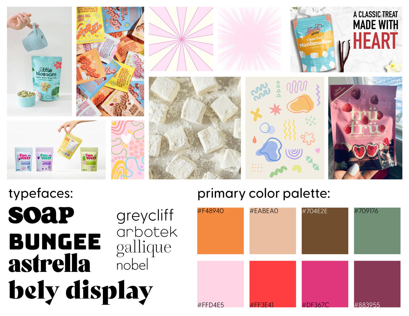
Keywords
- fun- whimsical- bright- borad appeal- colorful- inviting
CSUDH Graphics Work
At Cal State University Dominguez Hills, I worked as an Assistant Graphic Designer for the university’s Communications and Marketing Department. I worked alongside the lead graphic designers as well as people from other departments at the university (President’s office, Ceremonies & Events, Orientation, etc.) The work ranged from motion ads for the on-campus billboard, on-screen graphics to be broadcasted during commencement ceremonies, gifs as well as other graphics to be posted on the @csudominguzhills Instagram account, t-shirt designs for university merchandise, and more. Below are some samples of work I created.Duration: March 2023 - May 2024Tools used: Adobe Illustrator, After Effects, Photoshop, InDesign, Microsoft Office
CSUDH Logo Variation Animation
2023
Loop-able animation showcasing the University's various logo lock-ups and color ways. Used for a brand strategy and info presentaion
Homecoming Title Type Animations
2024
Title intros I made and animated for CSUDH's 2024 Homecoming
Digital Kiosk Ads
2024
Motion ads I created to promote the alumni benefits, shown on 1080x1920 screens around campus. Full quality videos are found on this youtube playlist
Promotional Identity: Personal Brand
This project highlights my visual identity. It includes the distinctive logo that I created with the intent to encapsulate the forward and out-of-the-box approach I take to my designs.Duration: February 2024Tools used: Adobe Illustrator, After Effects
Logo Variations
About the Logo
The logo depicts a heart-shaped planet with a ring wrapped around, connected to a symbol of my initials, G.S. The planet idea came from the idea to connect my emphasis of universal design into my brand. I wanted the logo design to have a free-flowing and flexible in order to visually communicate the versatile and humanistic approach I have to creating designs. The colors are soft, feminine pastel colors for an inviting and non-intimidating feel. Another version of the logo is featured at the top with the initials in the main focus and the gradient heart between the G and the S.
Logo Elements
NCT Dream Beatbox Lyric Booklet
This project takes inspiration from K-Pop group, NCT Dream's, lyric booklet inclusion from their 2022 Beatbox digipack album. The original booklets are member specific– 7 versions for each individual member. In this project, I incorporated all 7 members into one booklet with a new modified design.Duration: March 2024 - May 2024Tools used: Adobe Photoshop, Illustrator, InDesign
Flipbook
Equal Exchange Brand Redesign
In this project, I did a complete redesign of the coffee brand, Equal Exchange. I produced a logo, color palette, and mockups based off of the existing brand values / mission statement as well as create a brand book.Duration: August 2023 - December 2023Tools used: Adobe Illustrator, InDesign
original design
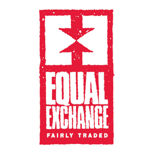
Redesign
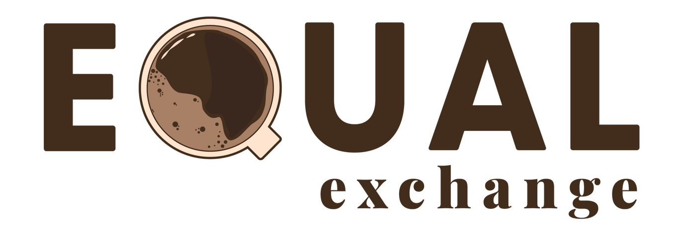
Brandbook
The Process
Equal Exchange is a sustainable co op that sells products such as coffee beans, tea bags, and chocolate. All their ingredients are ethically sourced and fairly traded by creating mutually beneficial partnerships with the farmers sourcing the ingredients.Through this design process, I wanted to rebrand Equal Exchange into a brand style that reflects its mission statement. I wanted the brand’s feel to be more soft, gentle, and soothing to look at rather than the loud and alarming concept it currently has right now while still representing the product they sell.
NCT 127 Crash Landing Lyric Animation
This is a lyric video animation I made for NCT 127’s song, Crash Landing. I first edited the song in Audacity to the specific parts of the song I wanted to use. The backgrounds were built in Adobe Illustrator with a dreamy feel to give the viewers the feeling of being in space. I then animated the backgrounds and its elements in After Effects.Duration: February 2024 - March 2024Tools used: Adobe After Effects, Illustrator, Audacity
VillageCore Internship
During the Fall of 2024, I was given the opportunity to intern for, VillageCore, a non-profit resource center, aiming to bridge the young and elderly generation through technology. During my time as an intern I gained social media marketing experience through creating and launching social media campaigns to promote the organization's app and companion book, as well as the programs launched through the organization. I also collaborated alongside the executive director during the launch of the app, Caregiving for Seniors, and worked on the UI/UX of the app (design, functionality etc.).Duration: August 2024 - PresentTools used: WordPress, Elementor, Figma Canva, Illustrator, Microsoft Office
caregiving for seniors app design
2024
Process of redesigning the Caregiving for Seniors, the companion app to the Experiences: Caregiving for Seniors book by Yasmin Shah
Bay Area Tennis Branding
I worked with a client to create branding for their private tennis coaching business geared towards children. When I connected with the client, they had only the business name, so I worked with them discussing what core beliefs and values they wanted their brand to embody.Duration: November 2024Tools used: Adobe Illustrator, InDesign
About Bay Area Tennis
Bay Area Tennis is a tennis coaching program founded by Coach Flor, a former tennis player from San Jose State University and current head coach for Moreau Catholic High School’s women’s and men’s tennis team. She is dedicated to nurturing young tennis talent and instilling a lifelong love for the game. She focuses on building strong fundamentals and refining technique, ensuring that every child, from beginner to advanced, reaches their full potential.
Core Values
Community: Creating a community that will support players through relationships between teammates, family members, and coaches.
Passion: Reminding the children that they should be playing tennis because they love and enjoy the game.
Resilience: Develop a “never give up” attitude and instill the standard to give 110% effort everyday.
Positivity: Not coaching players through fear and negativity, but positivity and constructive criticism.
Logo Elements
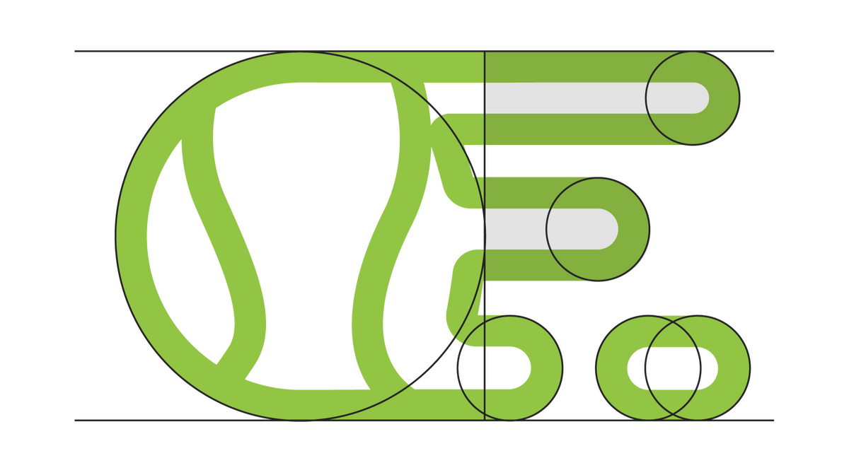
A depiction of a moving tennis ball, with motion shapes that form an ‘F’ for Flor. Consistent use of the circular shape to represent the tennis ball as well as to give an soft, youthful feel to represent the young players
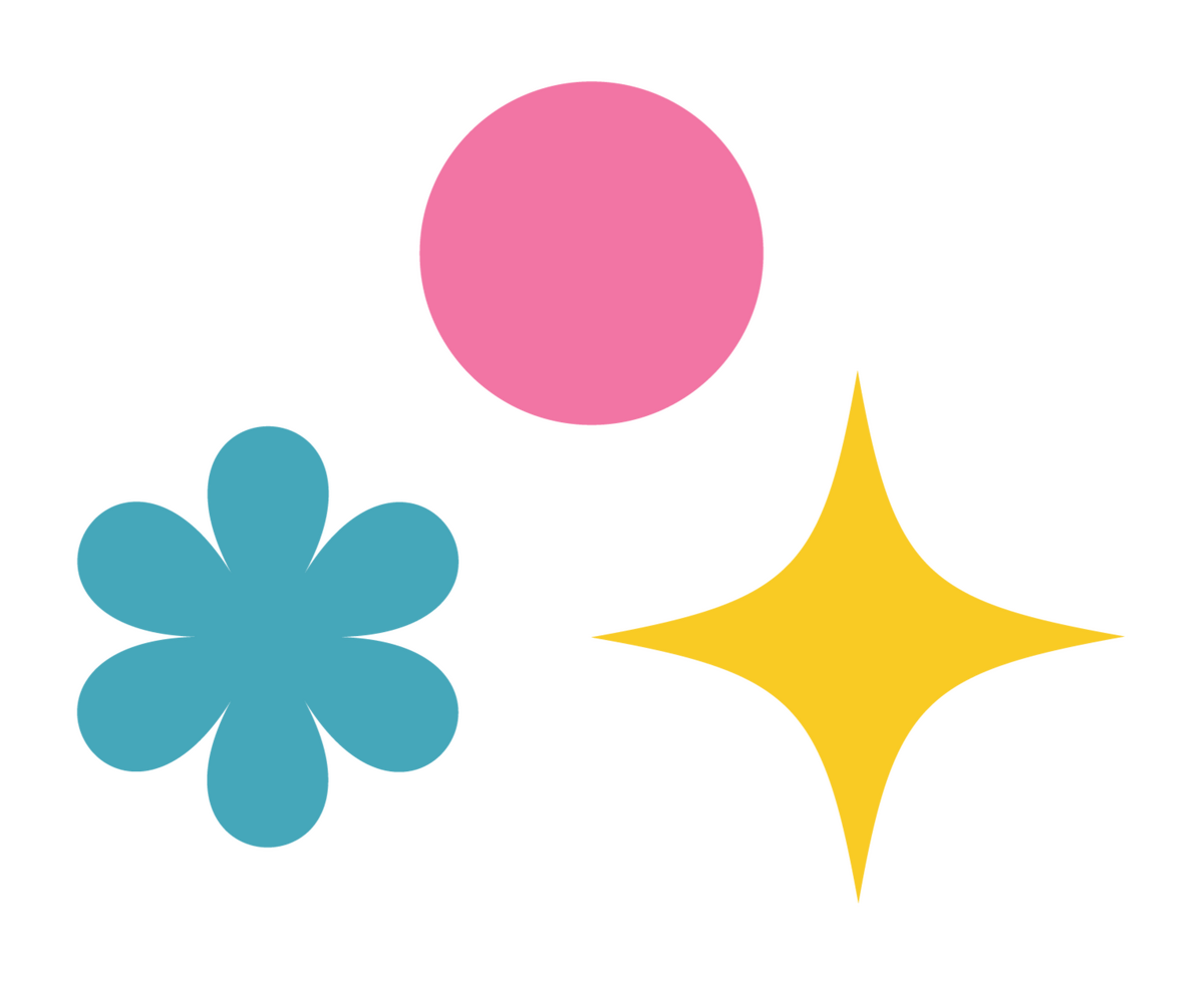
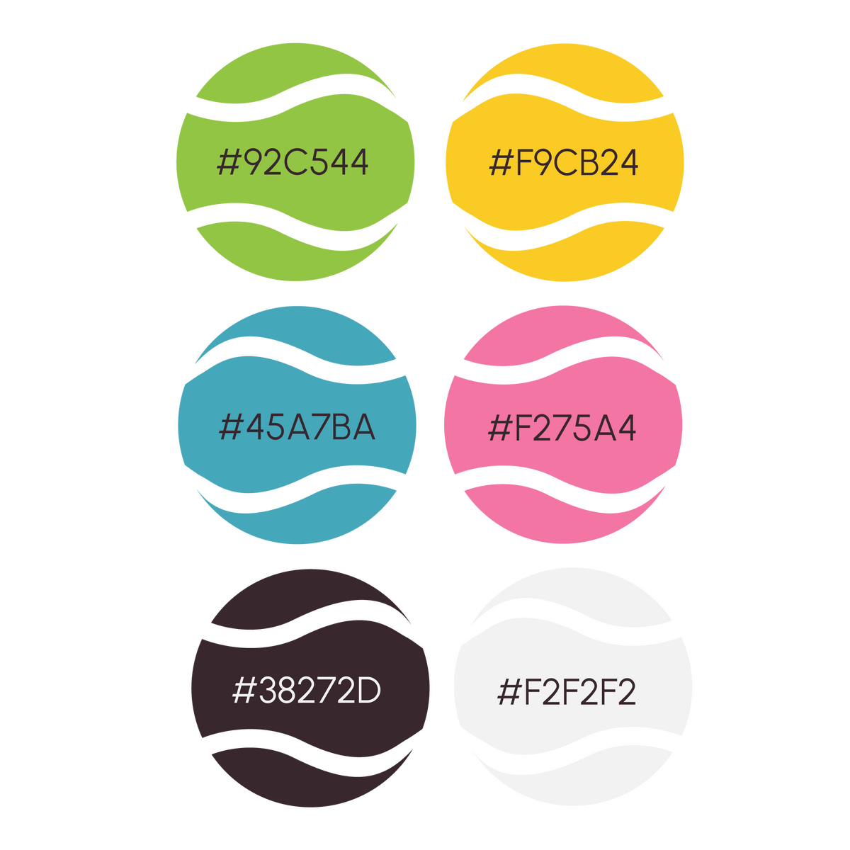
Fun, decorative shapes that bring a playful, childlike feel to the logo while keeping the design clean and neat. Uses similar rounded elements to stay cohesive with the rest of the design. With popular color psychology, the yellow sparkle represents positivity, the blue peace and trustworthiness, and pink love/passion, all tying into the core beliefs of Bay Area Tennis
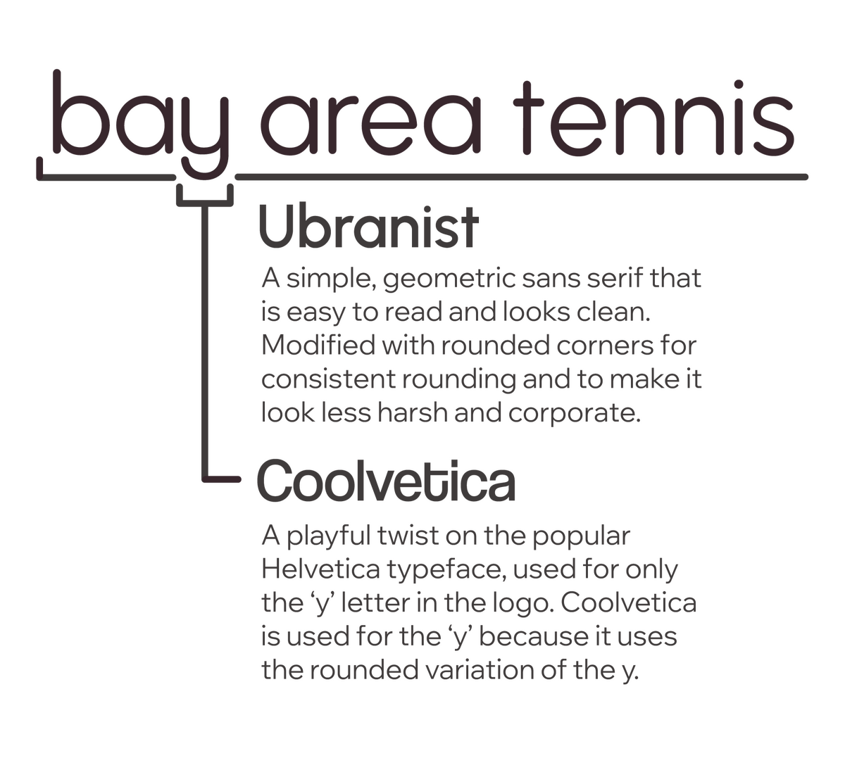
Typography
Color Palette
Web Design & UI/UX
Print Design
Adobe Illustrator
More CSUDH Projects
Hearthy Foods: Marshmallow Packaging
2024
Adobe Illustrator
Full project
Brand & Identity
Bay Area Tennis
2024

Defined brand's core values and personality, developed visual identity (logo, color palette)
Full project
Personal Branding
2023
Defined brand's core values and personality, developed visual identity (logo, color palette)
Full project
Motion Graphics
CSUDH: Homecoming Title Type Animations
2024
Adobe Illustrator, Adobe After Effects
More CSUDH projects
Adobe After Effects
More CSUDH projects


